
Track AI costs
Axis keeps a live cost total in the bottom bar so spend is visible while you work. Click that total to open the Global Usage Dashboard, where you can move from a quick total to the exact period, project, model, or provider responsible for it.
Proof sequence
Open the cost table and trace the spend
Start from the persistent cost total, then use the dashboard views to understand where usage came from.
Open costs from the bottom bar

Click the dollar total beside the running-session count to open the Global Usage Dashboard. Inspect the period and model mix
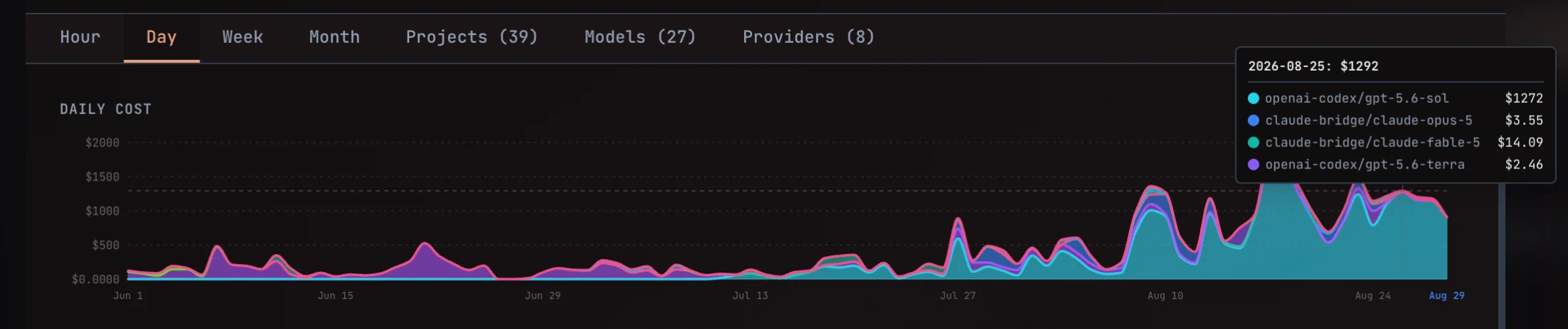
Choose a time scale, then hover or select a point to see the total and its model breakdown.
What the bottom-bar number means
Section titled “What the bottom-bar number means”The dollar figure in the bottom bar is the current tracked AI cost total. It stays available from the main Axis workspace so you do not have to leave your sessions to check spend.
Click the total whenever you want to answer a deeper question such as:
- What did we spend today, this week, or this month?
- Which project is using the most model capacity?
- Which models account for a cost spike?
- How much recorded usage came from each provider?
Mission: open the cost dashboard
Section titled “Mission: open the cost dashboard”- Look at the bottom bar beneath the main workspace.
- Find the dollar total beside the running-session indicator.
- Click the total to open Global Usage Dashboard.
- Start with the summary cards for Today, This Week, This Month, and All Time.
- Choose the view that matches the question you are trying to answer.
The cost dashboard is global: it can summarize usage across projects rather than only the session currently open.
Choose the right view
Section titled “Choose the right view”| View | Use it to answer |
|---|---|
| Hour | What happened during the current day, and which hour produced a spike? |
| Day | How did spend change across recent days? |
| Week | Which weeks were unusually expensive? |
| Month | How is longer-term spend trending? |
| Projects | Which project owns the cost and token usage? |
| Models | Which provider/model combinations account for spend and sessions? |
| Providers | Which provider, product, model, and operation generated recorded provider events? |
The number in parentheses on Projects, Models, and Providers is the number of tracked entries available in that breakdown—not a budget or spending limit.
Read the chart
Section titled “Read the chart”The time views use a stacked model breakdown. Each color represents a model, so the combined area shows total cost while the colored layers show which models contributed to it.
Hover over or select a point to inspect:
- the selected hour, date, week, or month,
- total cost for that period,
- the model-by-model amounts behind the total.
Use the shape of the chart to find the spike first, then use the tooltip and breakdown tabs to identify its owner.
Mission: explain one cost spike
Section titled “Mission: explain one cost spike”- Open Day to find the date with the unusual increase.
- Hover over that point and note the largest model contribution.
- Open Projects to see which project has the highest relevant spend.
- Open Models to compare that model’s cost, tokens, and session count.
- If the work used a separately recorded provider event, inspect Providers for the product, operation, quantity, event count, and cost.
- Open the relevant project or session to decide whether the spend matches the outcome.
The dashboard tells you where the cost came from. The owning session tells you what work that spend produced.
Costs and tokens tell different stories
Section titled “Costs and tokens tell different stories”Cost measures the recorded dollar value of usage. Tokens measure the volume of model input and output. A model can consume a large share of tokens without producing the same share of cost, because model and provider pricing differ.
Use both when comparing work:
- Cost helps manage budget and investigate spikes.
- Tokens help explain context size and usage volume.
- Sessions help connect aggregate model usage back to actual outcomes.
Known and unknown provider costs
Section titled “Known and unknown provider costs”The Providers view separates known-cost events from unknown-cost events. A known cost has enough recorded pricing information to calculate a dollar amount. An unknown cost records that usage happened but cannot safely assign a price.
Treat the dashboard as tracked usage, not a substitute for a provider’s final invoice. Provider pricing, discounts, credits, subscriptions, and unpriced events can make the provider statement differ from Axis’s recorded total.
Use project scope to act on the finding
Section titled “Use project scope to act on the finding”Use All Projects when you want the global picture and want to compare projects. Once you identify the project behind a spike, click that project and inspect its sessions, plans, and outcomes in the focused sidebar.
Cost is most useful when it stays connected to the result. A high-cost session may be appropriate for a valuable or difficult outcome; a low-cost session may still be wasteful if it repeatedly fails or produces no usable evidence.
Mission complete when
Section titled “Mission complete when”You can open costs from the bottom bar, choose the right time or breakdown view, identify the project and model behind a spike, and return to the owning session to judge the value of the work.